
Aug. 17, 2016 – As the old saying goes, a picture is worth a thousand words. If that is the case, then data visualization is nearly invaluable in our increasingly digital world. With so much information being created every day, it is especially important to be able to distill the salient points of this data into an image, graph, or map that is easily and quickly understood.
There are numerous tools available that allow attorneys and staff to input data and create an easy-on-the-eyes image that conveys intent that is supported by your statistics. These final products, called infographics, can be used in numerous ways in the courtroom, in the office, or even marketing your services to potential clients. The basics of data visualization provide an idea of what infographics can do for a law firm, be it large or small.
The Benefits of Infographics
The goal of many infographics is to inform. Lawyers have plenty of reasons to want to educate and update clients, co-workers, and others about their work and their jobs.
 Kris Turner is the Reference and Technology Services Librarian at the University of Wisconsin Law School Library. He has previously taught workshops on apps and infographics for lawyers.
A simple infographic on a law firm's webpage can illustrate the impact that certain crimes have on a community, or how many hours of pro bono work that firm contributes. These educational infographics can serve as an important marketing tool as well, since they can brand a particular firm as being competent, caring, and knowledgeable, all in one effective infographic.
Infographics grab the attention of the casual browser, educate them with the data that is provided, and then lead them back to the firm that created it – such as this one on making a will. By providing education via well-designed and visually engaging graphics, the law firms have created an opportunity for new clients to sign up, or at the very least, positive word-of-mouth.
Adding these infographics to your social media accounts or to your website will break up the monotony that a wall of text represents. 'Legalese' is a difficult and confusing language for many, and by making complicated issues more comprehensible, an infographic can provide goodwill for your firm, while simultaneously making your clients and potential clients more well-informed about the legal process.
This article will cover:
-
What is data visualization
-
How infographics are created and low-cost or free tools to create them
-
Why lawyers should use data visualization
-
Where and when to use your infographics
The tools or know-how to fully take advantage of data visualization range dramatically depending on how much data are added and what the general goal for the infographic is. Some tools can cost very little or nothing at all, while some companies can provide top-of-the-line infographics to law firms for a set price. Regardless, as law firms and courtrooms slowly migrate to a more digital world, infographics can provide a welcome relief from either walls of text or basic charts and graphs, all while making communication much easier.
What Are Infographics and Data Visualization?
It is very likely that you have run across infographics either online or in your everyday life. Infographics are the end result of data visualization, and bring all that dull but vital information to life. For an infographic that explains infographics, visit this page on the website for Customer Magnetism, a digital marketing company.
Some of the most common infographics take a specific subject and distill it down to its essential facts, presenting in a clean, easy-to-digest manner. The information could highlight numbers or facts – such as the one on Presidential Lawyers. With a clean layout and the ability to input the information themselves, lawyers can use infographics to present a case or market their services very effectively and professionally.
For example, the goal of this "Lawsuits in the U.S." infographic (scroll down to #5) is to efficiently use data to present the case that steps need to be taken to ease the number of frivolous lawsuits in the U.S. Instead of a wall of text or simple graphs, the infographic aims at combining these two communication methods, jamming as much pertinent information as possible into a format that is more palatable for many attorneys and the public in general.
In the last three years, there has been more of a push to integrate infographics into e-discovery and the entirety of case management. There are for-hire companies that can shape the data that attorneys have and create beautiful infographics. Companies, such as Recommind and A2L Consulting, take the mass amounts of sheer data that law firms inevitably deal with, and create content that can be used in everyday law offices. Of course, there are also do-it-yourself options out there for lawyers who want to keep data visualization entirely in-house.
Examples of Infographics from the State Bar of Wisconsin
“Just the Facts”
This infographic appeared in the Feb. 3, 2016, InsideTrack article, “National Study Highlights Alcohol and Mental Health Issues for Lawyers, Identifies Barriers to Seeking Help.” It shows results from a study of approximately 13,000 U.S. lawyers and judges regarding issues of substance abuse, depression, and anxiety.
Creating Infographics: Familiar Names, New Tools, and Techniques
There are numerous programs available for the willing DIY attorney or staff that can creatively visualize data. The questions that must be asked when determining which product is right for your law office are straightforward but necessary.
First, have your data ready to go and ensure that the data are worthwhile. Infographics can be a compelling argument in favor of something, but they also take a lot of time and/or money to produce. By confirming that your data will drive home the point you want to illustrate, your infographic will eventually make the cost worthwhile. With sound data as a foundation, create a visually appealing infographic that can grab attention, educate, or sway opinion.
The programs and tools that can do the actual creating run the gamut from free to costly, though often you get what you are paying for. A few of the more trusted tools are listed below, though remember that a free tool will likely not provide options for saving your infographics privately. If that is your goal, consider purchasing a subscription that allows for private publishing or download options.
Infographics are one of most important tools in making this data digestible and easily understandable for nearly everyone that you want to reach.
Piktochart
Piktochart is one of the most well-known infographic programs, and that is due to its flexibility in handling a variety of images and data. Piktochart allows its users to create infographics, posters, and presentations that really pop off the screen. There are both free and pro accounts available.
The learning curve is not very steep to create basic infographics, and it is very possible to distill complicated explanations into one image, such as this award-winning infographic.
Infogr.am
Infogr.am is another free program that focuses on making charts, graphs, and maps more colorful and powerful. Using an Excel-type spreadsheet, Infogr.am takes charts to the next level, mashing them up with more imagery and attention-grabbing data. The enhanced graphs and charts that it creates are very simple but elegant in layout, such as the one on this website. This familiar interface makes it easy to quickly edit data.
Note that the final products are published online and can be embedded on websites and elsewhere, so proprietary data are not recommended for Infogr.am, unless you upgrade your account.
Easel.ly
Easel.ly is another free tool available online that provides users with templates, graphics, and more in order to create infographics. Easel.ly focuses on educational areas, making it especially useful for introducing legal concepts to clients or even to juries. Once again, the learning curve is generally gentle, and the final infographics can be either saved online or downloaded as PDFs.
Timeline JS
Timeline JS covers a different type of data visualization. Users lay out events in chronological order and enhance the effect of each event with audio, visual, or clickable icons. An attorney could use Timeline JS to present the events that happened to their client, or to present the correct workflow for how a document is filed with the court for new assistants.
Timeline JS has been used by Time Magazine, CNN, Mashable, and others for unique online content. Timeline JS accepts content from a wide array of online sources, making it easy to create a chronology that is visually affective. The timelines themselves are published via a Google Spreadsheet and can be embedded in a website just like a Youtube video.
Google Charts
Google, unsurprisingly, also has an answer for data visualization in the form of Google Charts. If you feel comfortable with Google's accounts and layouts, this is an easy way to be introduced to data visualization. While not as attention-grabbing as some of the other tools discussed here, Google Charts does provide a nice selection of charts and graphs that can be quickly created and animated. It's also possible to create a live chart that updates in real time.
Carto
Carto is a powerful data-mapping program that gives users a glimpse into what data can show, given time and geographic space. With data about lawsuits in the U.S., numbers of accidents in the workplace, or movement of workers, a visually appealing map can tell numerous stories at a simple glance.
The most recent tool is the builder, which – although still in beta – allows for the quick upload and organization of data onto maps. Some know-how about mapping programs may be helpful, but Carto is meant to be intuitive for newcomers and professionals.
Carto is more expensive than the other tools listed above (you can sign up for free as an individual), but the results may be worth it if your practice needs to communicate via dynamic maps.
And More
These are only six examples that give a good idea of the powerful tools that are out there and waiting for their capabilities to be applied to the legal world.
Other data visualization programs, of varying degrees of intuitiveness and cost, can be found at these websites:
Step-by-Step: How to Visualize Data with Infogr.am and ABA Statistics
Chart creation – whether infographic or other data visualization – can be done very quickly and easily.
For this example, I will illustrate similar enrollment trends across the Midwest. I will use Infogr.am, and data that is found on the ABA Statistics website on the number of 1L students at various Midwestern universities.
Here are the steps to make this chart:
1) Get the data. In this case, download the data into an Excel spreadsheet file from the statistics page on the ABA website. This takes only a few seconds, and the data are dropped into a file editable within Infogr.am.
2) Create a free Infogr.am account.
3) You can either start with design or with the data. In this case, choose “start with data” to upload the data to Infogr.am.
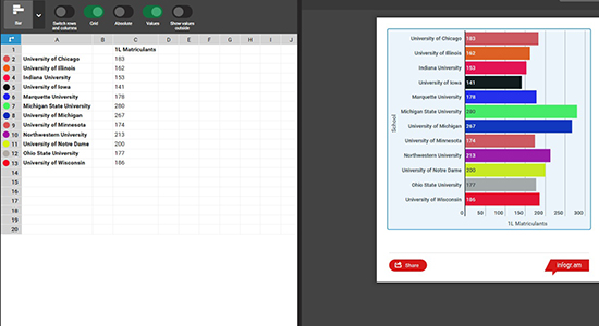
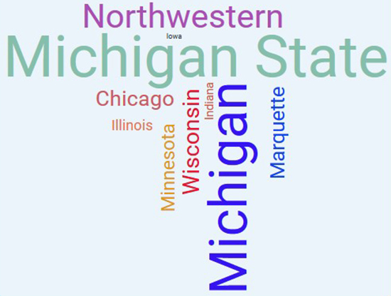
4) Adjust the look and feel of the chart. This is the most important aspect of data visualization (after the data itself). Infogr.am makes that easy by providing intuitive ways to switch around your data and easily edit labels, colors, and other areas to help your information really grab attention.
For this chart, I want to give viewers more than one way to digest this information. I used a wordcloud, based on the number of enrollments per school, as a way to provide basic information at a quick glance. I roughly assigned school colors to each name and the number of enrollments. Someone viewing my chart will easily determine that the two major law schools in Michigan enrolled the largest numbers of students in 2015, with Iowa enrolling the smallest class:
5) Download or publish the infographic. You can download infographics from Infogr.am as images (or as PDFs with a paid subscription), post it on its website or your own, and promote it on social media.
The sample infographic that I created in about one hour can be viewed on the Infogr.am website. The information is accurate, the layout is clean and simple to understand, and my goal of educating viewers about enrollment numbers has been accomplished very rapidly without forcing them to review rows upon rows of raw data. It does not take a large amount of technical expertise to make this simple but very effective infographic that people will remember.
Conclusion: Lawyers and Data
Data visualization is becoming more prevalent, as more data have become either freely available or the tools have become easier to use. Regardless, the clean way that your data are laid out in these eye-catching visuals can make your firm's presentations, website, workflow, or social media stand above all the others.
The level of sophistication that data visualization can provide varies greatly, depending on expertise, cost, and the patience that the firm has with creating an infographic. However, the data that serves as the foundation for all great visualizations is becoming increasingly available and important to companies from all types of businesses. Law firms can use this aggregated data to educate, market, emphasize, teach, and explain any number of complicated legal concepts or processes.
As the information age begins to reach new heights of usability and availability, many potential clients will expect to see data that supports any assertion and any advertisement. Infographics are one of most important tools in making this data digestible and easily understandable for nearly everyone that you want to reach.
A picture may be worth a thousand words, but a well-crafted infographic or data visualization may be priceless.
More Resources
For more resources about data visualization, infographics, and how they are used in legal practices, visit one of these websites:
